As far as the house goes, I only have mental progress to report, but there's a lot of it. And know that almost all of the mental images I've described in the past have changed quite a bit!
The week before last, I spent every evening after work at paint stores agonizing over swatches and what samples to take home. The walls are looking pretty schizophrenic around here with rashes of various colors splotched about. Last Sunday The Redhead and I finally collected some gallons of paint to have ready for whenever we can get to them. We weren't able to do any painting last week or weekend, but hopefully we can at least do some spackling and taping this week and get some accomplished after work...someday... Here are the colors we purchased (keeping in mind that once we get the rooms painted, we may adjust our ideas [again]).
Living room: Popped Corn by Behr

I actually never bought a sample of this, but I did buy samples of a white that was cooler than Popped Corn and one that was warmer. I wasn't totally happy with either of those I tried so I thought Popped Corn was a good compromise. By this time I was so tired of trying samples and looking at swatches, I went ahead and bought the gallons without sampling first. So there.
I decided on white for the living room because there are so many rooms that come off of it (study, kitchen, dining room and the stairway wall continues into the room in columns around the entryway), it really needed to be a neutral that could have accessories that tie those rooms together. I think white walls can be so crisp and fresh and make furniture and accessories pop. Plus, knowing me, I will want to change out the accessories from time to time to change the feel of the room. White walls will make that so much easier to accomplish.
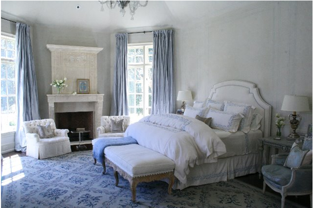
I just love the color blue, but couldn't bring myself to have a totally blue living room. I mean, that would be A LOT of blue! To incorporate the color without it being overwhelming, I decided that the kitchen and study will be blue, then I can bring their blue into the living room with curtains, which will look so fresh against the white walls. Here's an example below from Cote de Texas. The room itself has a much different feel than our living room will have, but the contrast between the curtains and the walls gives you the idea.
It looks like there we may also decide on a dark couch (either a taupe or dark gray) with dark wood legs and probably have a couple of my grandmothers chair recovered, which also have dark wood on them. I think they will look great against the white backdrop!
Kitchen: Surf by Martha Stewart (her colors are at Lowe's, but I had Sherwin Williams do colormatching because I've heard that Lowe's paint is of mediocre qulity)
 (I couldn't find a good online swatch I could retrieve for you, so this will have to do)
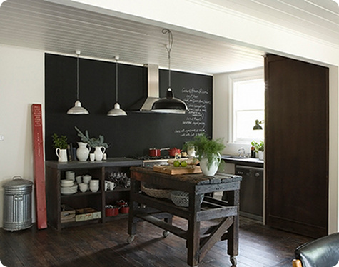
The kitchen's limited wall space will be this color blue. There is one wall that hides the fridge and that will be painted in chalkboard paint, because I thought I thought it would be a nice contrast and because it's just fun! This picture from design*sponge got my wheels turning for that:
I've also been thinking about this Martha Stewart project:
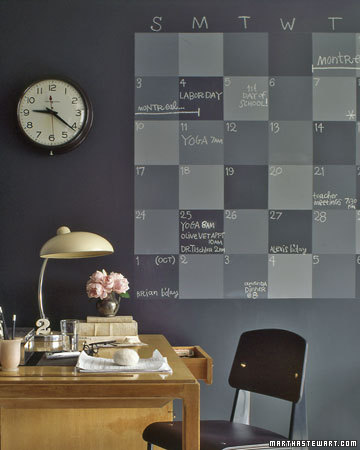
The kitchen seems like a good idea for this...if I could keep it neat. :)
Study: Sea Spray Blue by Martha Stewart
Flash player, again, shut me down from copying images, and I couldn't find a good picture of it online. However, it's basically a little lighter version of the kitchen color.
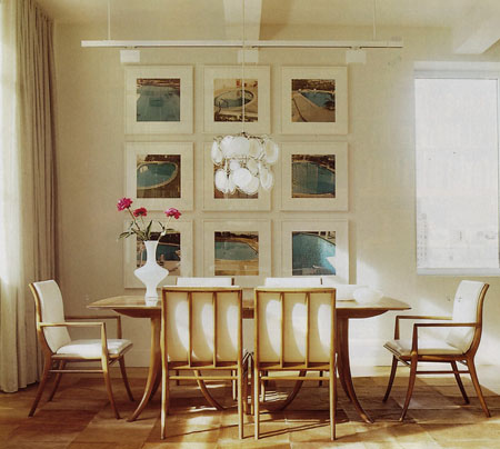
Both The Redhead and I liked the idea of a blue study. The rub lies in that it's a small room with a big, vaulted ceiling. It will be very interesting to see what the walls do to the paint color! The other challenge is making sure the blue compliments and doesn't detract from the pool collage that we want to do (The Redhead was a swimmer for most of his life and an NCAA waterpolo player). I got that idea from this picture found on beachbungalow8 a while back.
I think we will have so much fun together finding pictures for this project!
Dining Room: Mindful Gray by Sherwin Williams

Ok, ok, so I know I said I'd paint the room soft bluey/greeny then have red accents like Marie's dress. Turns out my china is way more green than I thought, which was clashing a lot with the colors I was trying (Tidewater by SW spoke to me). After much agonizing, the walls will be gray, and I'll have my chairs covered in turquoise to compliment the china.

Oh and at Round Top a few weeks ago I got the coolest light fixture for the dining room. I'll make sure to post all those fun finds next!
Upstairs hall/Stairs/Entry Columns: Repose Gray by Sherwin Williams

Master Bedroom: Dovetail by Sherwin Williams

I think the Dovetail flowing into the Repose will look really lovely. Hopefully something like this house I saw on d*s.
There you have it! A hypothetical paint tour. :) Now, if we can ever get started... I'll keep you posted. (Get it?! Posted! Ha!) Have a great week!
I've also been thinking about this Martha Stewart project:
The kitchen seems like a good idea for this...if I could keep it neat. :)
Study: Sea Spray Blue by Martha Stewart
Flash player, again, shut me down from copying images, and I couldn't find a good picture of it online. However, it's basically a little lighter version of the kitchen color.
Both The Redhead and I liked the idea of a blue study. The rub lies in that it's a small room with a big, vaulted ceiling. It will be very interesting to see what the walls do to the paint color! The other challenge is making sure the blue compliments and doesn't detract from the pool collage that we want to do (The Redhead was a swimmer for most of his life and an NCAA waterpolo player). I got that idea from this picture found on beachbungalow8 a while back.
I think we will have so much fun together finding pictures for this project!
Dining Room: Mindful Gray by Sherwin Williams
Ok, ok, so I know I said I'd paint the room soft bluey/greeny then have red accents like Marie's dress. Turns out my china is way more green than I thought, which was clashing a lot with the colors I was trying (Tidewater by SW spoke to me). After much agonizing, the walls will be gray, and I'll have my chairs covered in turquoise to compliment the china.
Oh and at Round Top a few weeks ago I got the coolest light fixture for the dining room. I'll make sure to post all those fun finds next!
Upstairs hall/Stairs/Entry Columns: Repose Gray by Sherwin Williams
Master Bedroom: Dovetail by Sherwin Williams
I think the Dovetail flowing into the Repose will look really lovely. Hopefully something like this house I saw on d*s.
There you have it! A hypothetical paint tour. :) Now, if we can ever get started... I'll keep you posted. (Get it?! Posted! Ha!) Have a great week!
I don't think I ever replied after you sent me your paint colors before, but I love them! The popped corn is a perfect white, I think, especially with those blues. And I LOVE that pool collage idea - it's so perfect for you guys! I'm leaning toward (one day in probably like 5 years) doing our bedroom in a similar gray with tone-on-tone damask stenciling. I love the idea but we'll see if it ever happens, and if I could ever furnish the room to match it! Anyway, all that to say I love it all and can't wait to see some of it up on the walls! But no pressure - my walls are still covered in color rashes too. :)
ReplyDeleteThank you, friend! I'm so happy we're going through this stuff together!
ReplyDelete